
From oncology to metabolic disease — these compounds are in high demand
| |
|
|
|
|
Popular Recommended Compounds for Disease Modeling!
In recent years, human disease models have played an increasingly vital role in life science research, becoming essential tools for exploring disease mechanisms and advancing translational medicine. Disease modeling involves artificially recreating disease states in animal or cell systems. With its features of being controllable, intuitive, and translatable, it enables researchers to gain deep insights into the onset and progression of diseases, and is widely used in drug screening, mechanism validation, and efficacy evaluation.
Induction methods for common human diseases include genetic modeling, drug-induced modeling, surgical modeling, and environmental modeling, as shown in the illustration depicting popular disease models and their corresponding modeling approaches.
TargetMol offers hundreds of products for disease modeling, covering a wide range of disease models including cancer, neurological disorders, immune and inflammatory conditions, endocrine and metabolic diseases, as well as cardiovascular diseases—meeting diverse research needs. 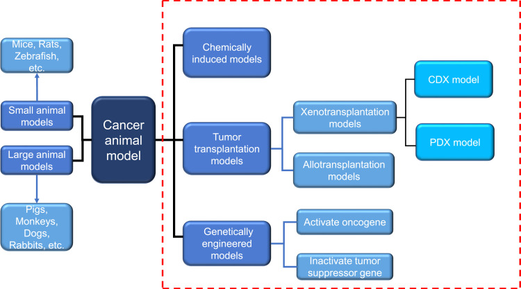 Induction Methods for Cancer Animal Models[1] Induction Methods for Cancer Animal Models[1]
|
|
|
|
|
Popular Products of Cancer Models
|
|
|
|
|
|
|
|
|
|
|
|
|
|
Popular Products of Immunology&Inflammation Disease Models
|
|
|
|
|
|
|
Phorbol12-myristate 13-acetate
|
|
|
|
|
|
|
|
|
|
|
|
Popular Products of Neurological Disease Models
|
|
|
|
|
|
|
|
|
|
Popular Products of Respiratory Disease Models
|
|
|
|
|
|
|
|
|
|
Elastase from porcine pancreas
|
|
|
|
|
|
|
|
|
|
Popular Products of Endocrine & Metabolic Disease Models
|
|
|
|
|
|
|
|
|
|
Popular Products of Cardiovascular Disease Models
|
|
|
|
|
|
|
|
|
|
|
|
|
|
|
|
|
|
|
|
|
/*** BMEMBF Start ***/
/* CMS V4 Editor Test */
[name=bmeMainBody]{min-height:1000px;}
@media only screen and (max-width: 480px){table.blk, table.tblText, .bmeHolder, .bmeHolder1, table.bmeMainColumn{width:100% !important;} }
@media only screen and (max-width: 480px){.bmeImageCard table.bmeCaptionTable td.tblCell{padding:0px 20px 20px 20px !important;} }
@media only screen and (max-width: 480px){.bmeImageCard table.bmeCaptionTable.bmeCaptionTableMobileTop td.tblCell{padding:20px 20px 0 20px !important;} }
@media only screen and (max-width: 480px){table.bmeCaptionTable td.tblCell{padding:10px !important;} }
@media only screen and (max-width: 480px){table.tblGtr{ padding-bottom:20px !important;} }
@media only screen and (max-width: 480px){td.blk_container, .blk_parent, .bmeLeftColumn, .bmeRightColumn, .bmeColumn1, .bmeColumn2, .bmeColumn3, .bmeBody{display:table !important;max-width:600px !important;width:100% !important;} }
@media only screen and (max-width: 480px){table.container-table, .bmeheadertext, .container-table { width: 95% !important; } }
@media only screen and (max-width: 480px){.mobile-footer, .mobile-footer a{ font-size: 13px !important; line-height: 18px !important; } .mobile-footer{ text-align: center !important; } table.share-tbl { padding-bottom: 15px; width: 100% !important; } table.share-tbl td { display: block !important; text-align: center !important; width: 100% !important; } }
@media only screen and (max-width: 480px){td.bmeShareTD, td.bmeSocialTD{width: 100% !important; } }
@media only screen and (max-width: 480px){td.tdBoxedTextBorder{width: auto !important;} }
@media only screen and (max-width: 480px){th.tdBoxedTextBorder{width: auto !important;} }
@media only screen and (max-width: 480px){table.blk, table[name=tblText], .bmeHolder, .bmeHolder1, table[name=bmeMainColumn]{width:100% !important;} }
@media only screen and (max-width: 480px){.bmeImageCard table.bmeCaptionTable td[name=tblCell]{padding:0px 20px 20px 20px !important;} }
@media only screen and (max-width: 480px){.bmeImageCard table.bmeCaptionTable.bmeCaptionTableMobileTop td[name=tblCell]{padding:20px 20px 0 20px !important;} }
@media only screen and (max-width: 480px){table.bmeCaptionTable td[name=tblCell]{padding:10px !important;} }
@media only screen and (max-width: 480px){table[name=tblGtr]{ padding-bottom:20px !important;} }
@media only screen and (max-width: 480px){td.blk_container, .blk_parent, [name=bmeLeftColumn], [name=bmeRightColumn], [name=bmeColumn1], [name=bmeColumn2], [name=bmeColumn3], [name=bmeBody]{display:table !important;max-width:600px !important;width:100% !important;} }
@media only screen and (max-width: 480px){table[class=container-table], .bmeheadertext, .container-table { width: 95% !important; } }
@media only screen and (max-width: 480px){.mobile-footer, .mobile-footer a{ font-size: 13px !important; line-height: 18px !important; } .mobile-footer{ text-align: center !important; } table[class="share-tbl"] { padding-bottom: 15px; width: 100% !important; } table[class="share-tbl"] td { display: block !important; text-align: center !important; width: 100% !important; } }
@media only screen and (max-width: 480px){td[name=bmeShareTD], td[name=bmeSocialTD]{width: 100% !important; } }
@media only screen and (max-width: 480px){td[name=tdBoxedTextBorder]{width: auto !important;} }
@media only screen and (max-width: 480px){th[name=tdBoxedTextBorder]{width: auto !important;} }
@media only screen and (max-width: 480px){.bmeImageCard table.bmeImageTable{height: auto !important; width:100% !important; padding:20px !important;clear:both; float:left !important; border-collapse: separate;} }
@media only screen and (max-width: 480px){.bmeMblInline table.bmeImageTable{height: auto !important; width:100% !important; padding:10px !important;clear:both;} }
@media only screen and (max-width: 480px){.bmeMblInline table.bmeCaptionTable{width:100% !important; clear:both;} }
@media only screen and (max-width: 480px){table.bmeImageTable{height: auto !important; width:100% !important; padding:10px !important;clear:both; } }
@media only screen and (max-width: 480px){table.bmeCaptionTable{width:100% !important; clear:both;} }
@media only screen and (max-width: 480px){table.bmeImageContainer{width:100% !important; clear:both; float:left !important;} }
@media only screen and (max-width: 480px){table.bmeImageTable td{padding:0px !important; height: auto; } }
@media only screen and (max-width: 480px){img.mobile-img-large{width:100% !important; height:auto !important;} }
@media only screen and (max-width: 480px){img.bmeRSSImage{max-width:320px; height:auto !important;} }
@media only screen and (min-width: 640px){img.bmeRSSImage{max-width:600px !important; height:auto !important;} }
@media only screen and (max-width: 480px){.trMargin img{height:10px;} }
@media only screen and (max-width: 480px){div.bmefooter, div.bmeheader{ display:block !important;} }
@media only screen and (max-width: 480px){.tdPart{ width:100% !important; clear:both; float:left !important; } }
@media only screen and (max-width: 480px){table.blk_parent1, table.tblPart {width: 100% !important; } }
@media only screen and (max-width: 480px){.tblLine{min-width: 100% !important;} }
@media only screen and (max-width: 480px){.bmeMblCenter img { margin: 0 auto; } }
@media only screen and (max-width: 480px){.bmeMblCenter, .bmeMblCenter div, .bmeMblCenter span { text-align: center !important; text-align: -webkit-center !important; } }
@media only screen and (max-width: 480px){.bmeNoBr br, .bmeImageGutterRow, .bmeMblStackCenter .bmeShareItem .tdMblHide { display: none !important; } }
@media only screen and (max-width: 480px){.bmeMblInline table.bmeImageTable, .bmeMblInline table.bmeCaptionTable, .bmeMblInline { clear: none !important; width:50% !important; } }
@media only screen and (max-width: 480px){.bmeMblInlineHide, .bmeShareItem .trMargin { display: none !important; } }
@media only screen and (max-width: 480px){.bmeMblInline table.bmeImageTable img, .bmeMblShareCenter.tblContainer.mblSocialContain, .bmeMblFollowCenter.tblContainer.mblSocialContain{width: 100% !important; } }
@media only screen and (max-width: 480px){.bmeMblStack> .bmeShareItem{width: 100% !important; clear: both !important;} }
@media only screen and (max-width: 480px){.bmeShareItem{padding-top: 10px !important;} }
@media only screen and (max-width: 480px){.tdPart.bmeMblStackCenter, .bmeMblStackCenter .bmeFollowItemIcon {padding:0px !important; text-align: center !important;} }
@media only screen and (max-width: 480px){.bmeMblStackCenter> .bmeShareItem{width: 100% !important;} }
@media only screen and (max-width: 480px){ td.bmeMblCenter {border: 0 none transparent !important;} }
@media only screen and (max-width: 480px){.bmeLinkTable.tdPart td{padding-left:0px !important; padding-right:0px !important; border:0px none transparent !important;padding-bottom:15px !important;height: auto !important;} }
@media only screen and (max-width: 480px){.tdMblHide{width:10px !important;} }
@media only screen and (max-width: 480px){.bmeShareItemBtn{display:table !important;} }
@media only screen and (max-width: 480px){.bmeMblStack td {text-align: left !important;} }
@media only screen and (max-width: 480px){.bmeMblStack .bmeFollowItem{clear:both !important; padding-top: 10px !important;} }
@media only screen and (max-width: 480px){.bmeMblStackCenter .bmeFollowItemText{padding-left: 5px !important;} }
@media only screen and (max-width: 480px){.bmeMblStackCenter .bmeFollowItem{clear:both !important;align-self:center; float:none !important; padding-top:10px;margin: 0 auto;} }
@media only screen and (max-width: 480px){
.tdPart> table{width:100% !important;}
}
@media only screen and (max-width: 480px){.tdPart>table.bmeLinkContainer{ width:auto !important; } }
@media only screen and (max-width: 480px){.tdPart.mblStackCenter>table.bmeLinkContainer{ width:100% !important;} }
.blk_parent:first-child, .blk_parent{float:left;}
.blk_parent:last-child{float:right;}
/*** BMEMBF END ***/
/* ---extra-- */
table[width="100%"] { width: 100%; }
table[align="center"] { margin: 0 auto; }
td[align="center"] { text-align: center; }
table { margin: 0; border-collapse: collapse; }
th, td { padding: 0 }
table[width="600"] { width: 600px; }
table[width="200"] { width: 200px; }
 検索
検索